Halden Skincare

Client
Halden, Porto
Services
Naming, identity, packaging
Year
2022 — ongoing
Still in use
4 years
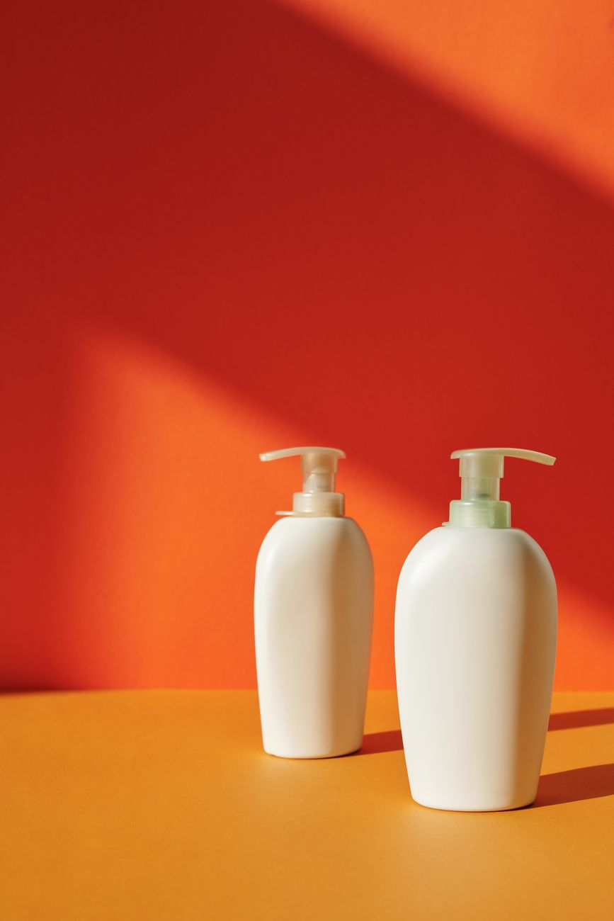
Two Halden pump bottles on a red and orange ground

Challenge

A founder with a great formula and a name nobody could pronounce, launching into the most crowded aisle in the shop.

Approach

Rename first. Then one bold colour, one typeface, and packaging that works on a shelf seen from four metres away.

Result

Stocked in 140 shops in the first year. Four years on, the packaging has not changed and nobody has asked it to.
The system

One colour, one face

  • Halden Orange#E8572A · 70 %
  • Pump Black#1A1414 · 20 %
  • Bottle White#F4EFE7 · 10 %
Typeface
Halden Grotesk, two weights
Rule
The name is always set in orange on white, or white on orange. Nothing else.
Shelf test
Readable at 4 m in a lit aisle
“They argued us out of the logo we asked for and into the one we still use.”
Inês Carvalho — Founder, Halden

Next project

Geisel Institute Brutalist library building against a blue sky

Have a project?

Start a conversation